Plot.py ‐ Basic Usage
Plot.py provides improved, customizable charts and new indicators for analysis. It adds new visual tools for delivery analysis. It works like any command line application with options.
Note: Plot.py requires the mplfinance version 0.12.10b0 or higher.
If you haven't updated yet, run:
pip install -U mplfinance
This tutorial divided into five parts
- Plot.py - Basic Usage
- Plot.py - Watchlists and Presets
- Plot.py - Drawing Trends and Trading lines
- Delivery Analysis - Using plot.py and dget.py
- Configuration
To plot a single chart, use the --sym option providing the symbol name. You can also pass multiple symbols, but for now lets stick to one.
py plot.py --sym tcs

Press 'h' will display help with keyboard and mouse controls.
Press 'q' to quit the chart. There are additional keyboard controls provided by Matplotlib. See Matplotlib keyboard shortcuts
By default, plot.py uses the daily timeframe. To display weekly timeframe charts, use --tf option passing the 'weekly' argument.
py plot.py --sym tcs --tf weekly
Its 17th Aug 2023 today, to study charts from 17th March 2023; use --date option passing the date in ISO format (YYYY-MM-DD)
Use it to study charts during specific periods without future bias.
py plot.py --sym 'nifty 50' --date 2023-03-17

To add volume, use -v or --volume
py plot.py --sym sunpharma -v

To add Simple moving average (SMA) to the chart, use --sma.
py plot.py --sym icicibank --sma 50
To add Exponential moving average (EMA), use --ema.
py plot.py --sym icicibank --ema 30
EMA calculation is exactly the same as TradingView. (Switch on adjusted prices to compare)
To add Simple moving average (SMA) of Volume, use --vol-sma.
py plot.py --sym icicibank --vol-sma 30
To add multiple moving averages, use space separated values.
py plot.py --sym icicibank --sma 50 100 200

To calculate it, divide the stock closing price by the index closing price. It uses Nifty 50 by default, but is configurable to use any index.
A rising RS indicates the stock is outperforming the index and vice versa. You can read this excellent article on Dorsey Relative Strength - chartmill.com.
To add this indicator to chart, use --rs option
py plot.py --sym escorts --rs

I read about this indicator in Stan Weinstein's book 'Secrets For Profiting in Bull and Bear Markets'. I highly recommend you to read the book.
NOTE: MRS uses SMA period of 52 weeks on Weekly and 60 days on Daily charts. Both are configurable.
To calculate, divide the regular RS by its 52 period moving average.
It essentially compares the RS to its 52 period moving average. The MRS value less than zero, indicates the RS line is below the moving average and vice versa.
An RS line with a moving average of RS line would display the same information as MRS.
You can read more on Manfeild Relative Strength - chartmill.com. Also read Stan Weinstein's book for numerous examples on using this indicator.
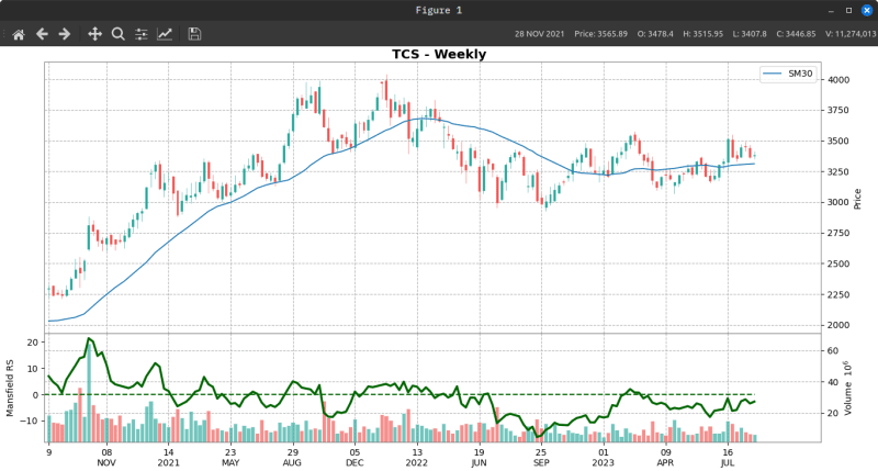
To add this indicator to chart, use --m-rs option. It is best used with the weekly chart.
py plot.py --sym 'm&m' --tf weekly --m-rs
Take note 'm&m' in single quotes. Stocks with '&' and <space> characters in the name must be quoted to avoid errors.
Other examples would be 'nifty 50', 'il&fseng'.

Notice the helpful zero line (dashed line) on the indicator in the chart above.
To replicate the charts from Stan Weinstein's book, see below
py plot.py --sym tcs --tf weekly -v --m-rs --sma 30
We can plot support and resistance lines on chart with the --snr option.
It looks for:
- two successive highs, followed by two successive lows for resistance.
- two successive lows, followed by two successive highs for support.
To simplify, its a 4 bar price rejection. It's not perfect, but works reasonably well. See the chart below.
py plot.py --sym ratnamani --tf weekly --snr

By default, plot.py will plot 160 candles on daily and 140 candles on weekly. You can configure it or use the --period passing an integer for the number of candles.
py plot.py --sym apollotyre --period 60
Use it to get a larger perspective or narrow your focus on a particular region of the chart. You can combine it with the date option for better result.
The chart window provides many features like displaying candle values, dates etc and mouse/keyboard interaction with the chart.
If you prefer to save the charts to a file, you can do so with --save option.
The images are large, so set your image viewer to resize to screen width.
Play around with these options and familiarize yourself. If you forget any options or need a reminder, use -h or --help to display the help.
py plot.py -h
or
py plot.py --help
You don't have to type all these options every time. In the next section, I'll show the easier way with watchlists and presets.